To redesign Lidera Mujer consulting firm’s website considering its visual, work and communicational identity as the pillars of the design process. This in a limited period of time, which forced us to find a solution that wouldn’t harm the aesthetic or development aspects. To achieve this, the task was to converge an agile design process (considering reviews and repeated iterations) with the feasibility of building it through WordPress blocks that did not require too much time in development.
As an exercise prior to the design process, each team member had to create their version of what they thought the structure of the site should be. The main objective of this assignment was to understand how the blocks work, so everyone could be able to think about the design based on the block structure, which facilitated iterations with development, reaching the final design in a more quickly and efficiently way.
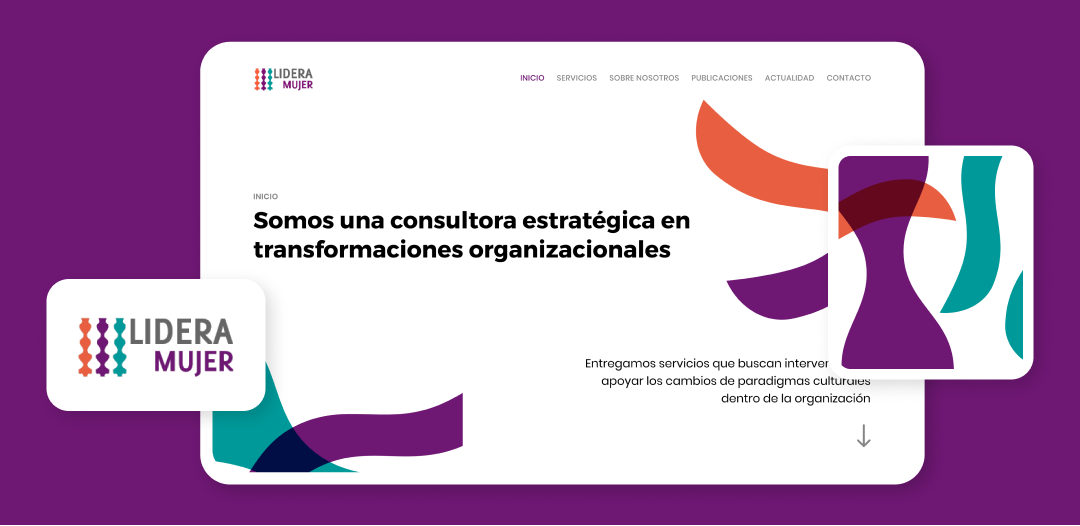
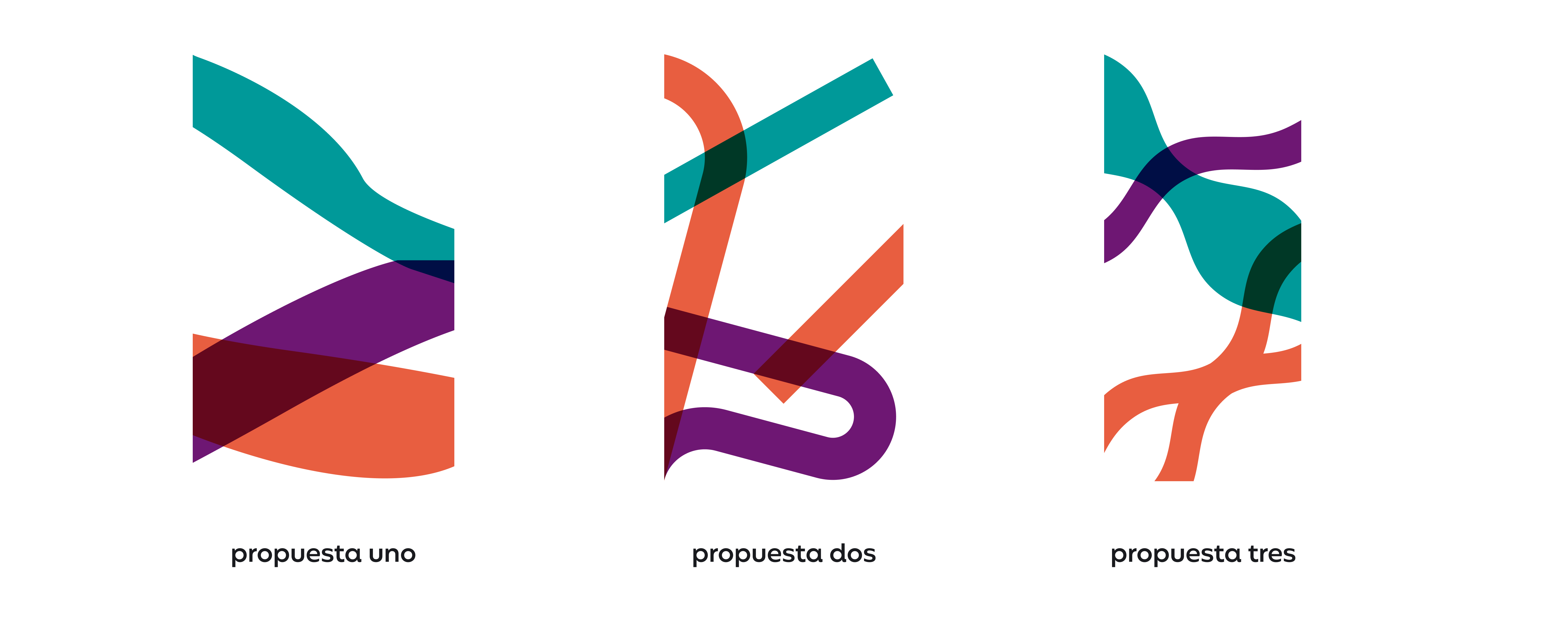
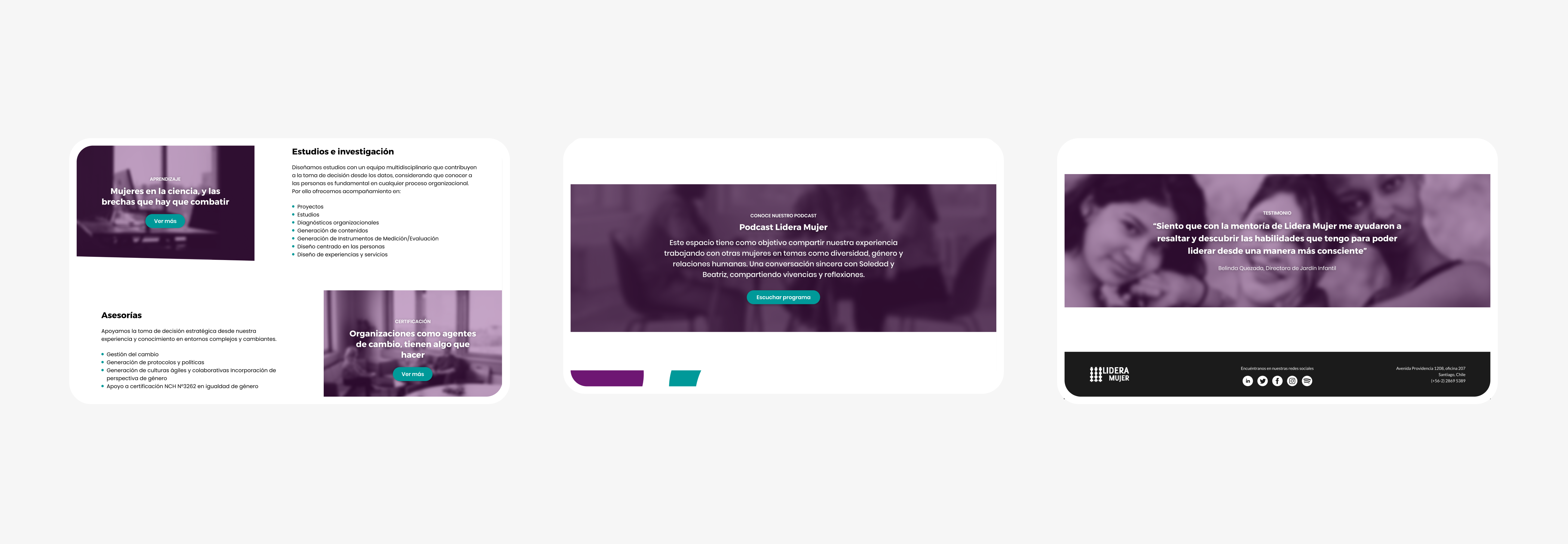
Although the consulting firm had a defined visual, professional and communicational identity, its web site was lacking it, showing a generic aesthetic that did not communicate everything they needed. To begin the design process we focused on the logo, its colors and shapes. We realized that the shapes used in the logo formed “waves”, and that, when viewed in perspective, these waves formed opening and closing points.
It was important for the client to distance themselves from the idea of the classic “white business woman” and to show concepts such as intersectionality and collaboration, which is why transparencies and figures that were intertwined with each other were used as a reference.
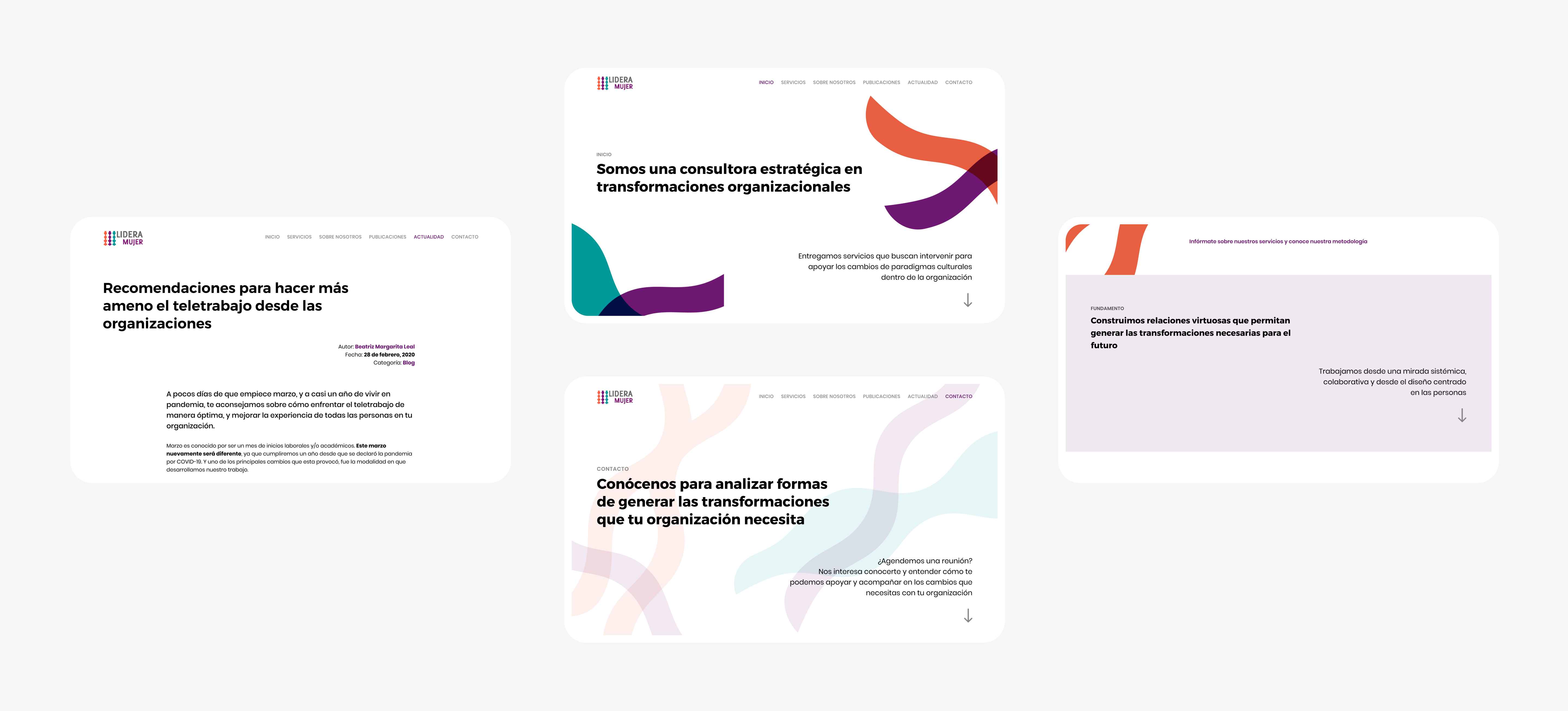
Each content horizon within the site was intended to be a separate block so the handover between design and development would be more fluid and efficient, to avoid wasting time on situations that delayed the process.
The graphic headers on every page of the website were made from a combination of three figures and three colors. These figures were intertwined through transparencies, generating infinite different combinations, which suggested intersectionality and collaboration.
Each text block in every horizon was intended to lead the next one through a staggered reading. Each left-aligned text is accompanied by a right-aligned text, anticipating the next content horizon.
The typeface used for titles and headers is “Trueno”, created by Julieta Ulanovsky, an Argentine female designer and typographer. The decision to choose a font created by a Latin American woman was not accidental. We believe that it’s consistent with the message that the client wants to deliver.
Although the initial idea was not to use the classic stock images, we found ourselves in the situation where we needed to use them for certain sections. The selection of these images was very strict so we didn’t fall into the stereotypes in which we didn’t want to fall. We made the decision to put all the images under a purple filter in order to standardize them and make them less prominent, leaving them in the background.
The result of this project is a website that shows the client’s visual, professional and communicational identity as it was originally intended. The new aesthetic is consistent with how the client wanted to show themself. The website shows the information in a clear and well-defined way.
The possibility of using blocks to set up the site gives the client the freedom to make the changes they deem necessary in the future, being in control of their own decisions.